skip to main |
skip to sidebar


Croped


The National Student Magazine Front Cover
The National Student Magazine Double Page Spread


The Drama Student Magazine Front Cover


Sryracuse University Magazine Front Cover
Syracuse University Magazine Double Page Spread

Syracuse University Magazine

Pleminary Topic: Student Magazines
By Alexander Bright
Portfolio Navigation
Student Magazine Front Cover
Student Magazine Front Cover
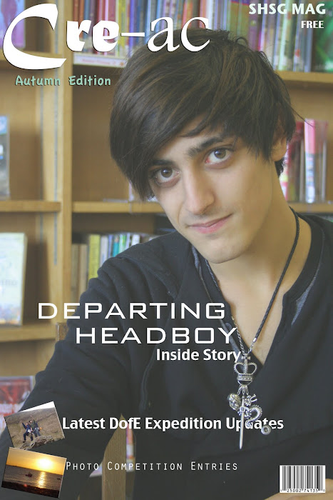
Here I have taken an appropriate photograph that I captured and used it as my background image for the front cover of the magazine.
I decided to use mostly white font as it would show up and appear readable over the darker colours demonstrated in the background, especially his dark top and hair.
I have used a light green tone for the "Autumn Edition" text as it adds character and interest to the magazine and appears nicely below the title.
I created the name "Cre-ac" as I believe that there are two key personalities within education, those who are creative and those who are academic, sometimes you may find students who are both. So therefore i took the begging letters of both words and combined them together. I felt that this was suitable as it was a school magazine. It also gives the magazine potential to feature articles of creative or academic stories or news. The fonts that I have used within the title reflect the meaning and connotations of each word. The font used for "cre" appears more creative and interesting, especially as the 'C' is larger and provides an interesting shape. Similarly the font used for "ac" reflects the academic and formal style and characteristics.
In contrast I have used an unusual font for the headline "Departing Headboy" to draw the audiences attention and I also feel that this font is one that would appeal to all and could be used in a variety of contexts.
I decided to include pictures in the bottom left corner of the magazine cover to add colour and draw interest. They also help to anchor the stories that they are match with that would appear within the magazine.
On the word "updates" at the bottom of the cover, I decided to layer it behind his necklace as I thought that this would follow conventions used in many magazines and also makes the necklace appear dominant over the text.
I have not positioned any text over the subjects face as this would appear incorrect as the reader wants to make a connection with facial features, especially eye contact is essential. I have left an area around the subjects face without any information and this makes the photograph much more connecting with the reader.
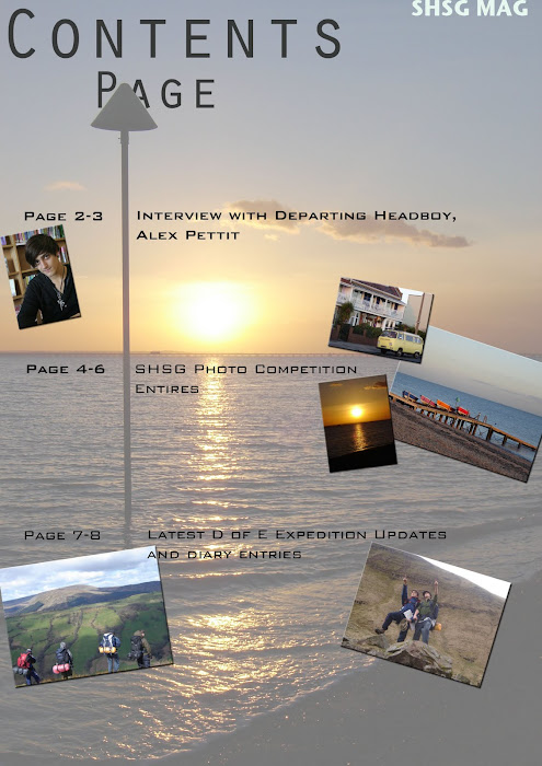
Contents Page
Student Magazine SLR Front Cover Photographs
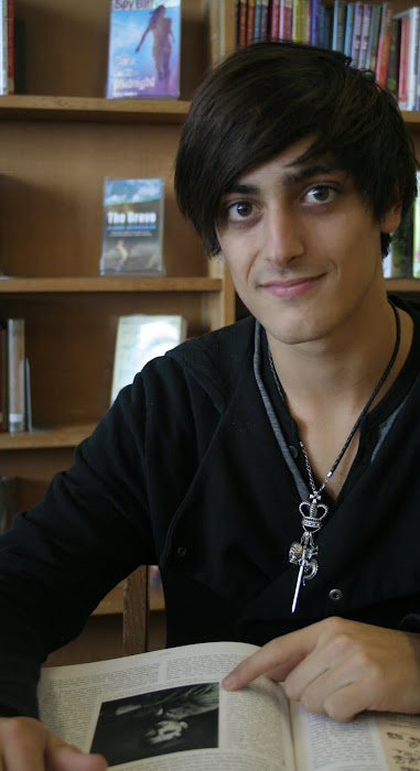
I have used an SLR Camera to capture a number of shots of the Departing Head Boy and thought that for a school magazine a good opportunity for a story would to write an article the ex-head boy's year in his role.
I decided to capture these photographs in the library, intending to create the bookshelves for the background acting as the mise-en-scene and therefore connoting academia and a school atmosphere. I felt that this appropriate for an article about the Head Boy and especially for a school magazine.
I decided to capture these photographs in the library, intending to create the bookshelves for the background acting as the mise-en-scene and therefore connoting academia and a school atmosphere. I felt that this appropriate for an article about the Head Boy and especially for a school magazine.
Front Cover Photographs
Previous Shot Description
This photograph is fairly proportional in terms of incorporating the rule of three. His body is positioned further towards the right of the frame and therefore appears more pleasing to the eye.
The lighting contrast in this shot appears better than the others as the shadows are well placed.
The shot is a medium close up which is required.
I feel that this shot has potential for the photograph to use for my student magazine.
The lighting contrast in this shot appears better than the others as the shadows are well placed.
The shot is a medium close up which is required.
I feel that this shot has potential for the photograph to use for my student magazine.
Front Cover Photographs
Previous Shot Description
This shot is a good capture of expression and conveys positive messages, although the subject is too centralized and appears awkward and also does not abide by the rule of three. The lighting is adequate whoever it could be better.
Front Cover Photographs
Croped
Previous Shot Description
Here I have cropped the same photo as the one before. I have decided to crop the shot from the left, and therefore it appears more appealing to the eye. From cropping it from the right of the shot, I have moved the subject further to the right of the remaining photograph. This now forces the subject to abide by the rule of three.
I would consider using this as my main front cover photo, although expanding it to a larger size in order to fit an A4 sized page could reduce its quality.
I would consider using this as my main front cover photo, although expanding it to a larger size in order to fit an A4 sized page could reduce its quality.
Front Cover Photographs
Previous Shot Description
In this photograph the lighting is too dark, this reduces the detail and facial features and also reduces the quality of the photograph altogether.
The subject appears too far away from the camera and would not connect to the readers if it appeared on the front cover of a magazine.
The subject appears too far away from the camera and would not connect to the readers if it appeared on the front cover of a magazine.
Front Page Flatplan
Flat Plans
I have created a number of flat plans to assist me in designing an appropriate front cover for my Student Magazine. These will help to guide me as to the layout of my magazine and allows me to develop any initial thoughts that I have.
Magazine Flat Plan 1
Latest Profile Page/ Mood Board
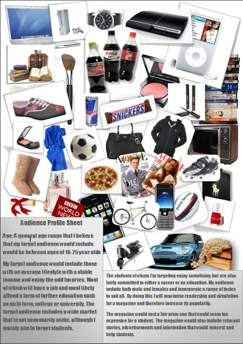
Latest Audience Profile Page
I have altered my original mood board and improved it to act as my audience profile page. I have given important figures and statistics that would apply to the target audience of my magazine. I do this to display to others the average reader of my magazine. This helps to define clearly what would need to be included in the magazine and to suit the audience.
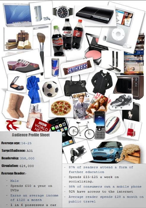
My Audience Profile Sheet/ Mood Board
Audience Profile Sheet/ Mood Board
Here i have created an audience profile sheet/ mood board to demonstrate the types of personalities and characters that my target audience would be. I have tried to target a student based audience of whom either go to Sixth form, college or university.
The students that I am specifically targeting would be those who enjoy socialising but are also dedicated to their further studies.
I believe that my style of the magazine would suit a wide range of students. I believe that the audience who would purchase a magazine of this style would most likely be in a stable financial status and who might enjoy a few luxuries as well as the necessities.
I have incorporated a variety of images to demonstrate what could feature in the magazine and also the objects that the readers would enjoy and possibly purchase
Student Magazine Analysis
The National Student Magazine Front Cover
The National Student Magazine Front Cover Analysis
If you left click on the Images of the magazine, it will enable you to view the website and the magazine further.
The target audience for this magazine is aimed at students. They emphasise this through the title of the magazine, "The National Student Magazine". In order to aim the magazine at their particular target audience they must incorporate relevant and interesting content that would appeal to students.
The colour theme to the magazine contrasts with a background tone of silver and white. The white connotes a light source which helps to anchor and frame the subject in the centre of the cover. The colour theme is also associated with contemporary themes which would also appeal to a young student target audience.
The subjects in the shot include puppets which are usually associated with laughter, enjoyment and entertainment most often appealing to children. This would seem to be a interesting contrast to display the subjects on the front cover of a student magazine. The puppets are also often associated with fear, horror and intimidation. The human figure also has connotations of his facial expression which connote intimidation.
The text used as the title, is quite modern and of a fairly large size. It has been placed at the top left of the page and contrasts with the dark and light background.The fonts used for all the texts displayed on the cover have contemporary connotations and would suit most students' tastes. I would suggest that this particular front cover would suit the interests of more males than it would females.
Student Magazine Analysis
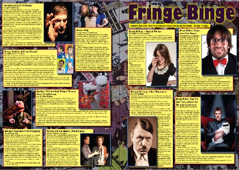
The National Student Magazine Double Page Spread
Student Magazine Analysis
The Drama Student Magazine Front Cover
The Drama Student Magazine Analysis
This magazine is specifically targeting drama students. This would be considered as a niche market and would narrow the publisher's readership and circulation. Although many non-drama students would consider reading the magazine if it contains interesting content.
The main coverage of the front page is captured by the close up of the subject. The subject dominates the space of the front cover. The subject being a male could be considered to emphasise the target audience of the magazine focused on female drama students. This again narrows the readership audience to mainly female drama students.
The text of the front cover does not overlap the subject's face. This is a typical feature of a magazine as the reader feels inclined to make eye contact with the subject. If the subject's face is distorted, this may make the reader feel irritated or intimidated. The expression of the eyes is a key concept to convey a new message of meaning and feeling. The age of the subject may appeal to the age of the targeted audience.
There is a variety of texts including a contrast in font, size, colour and positioning. All of these points are vital to the construction of a magazine. They are goverened by the way in which the audience's eye reads the page.I know from past experience that the readers's eye views the page from top left to bottom right. And this would explain the 'staggering' effect of the text in the bottom left of the page.
The text at the foot of the page is broken in topics and subjects by bullet points. This technique is used to display to the reader what topics or stories will be covered in the magazine. The text is once again of a modern, contemporary theme which would appeal to the target audience of young drama students, mainly female in this case.
Universiy/ Student Magazine Analysis
Sryracuse University Magazine Front Cover
Syracuse University/ Student Magazine Front Page Analysis
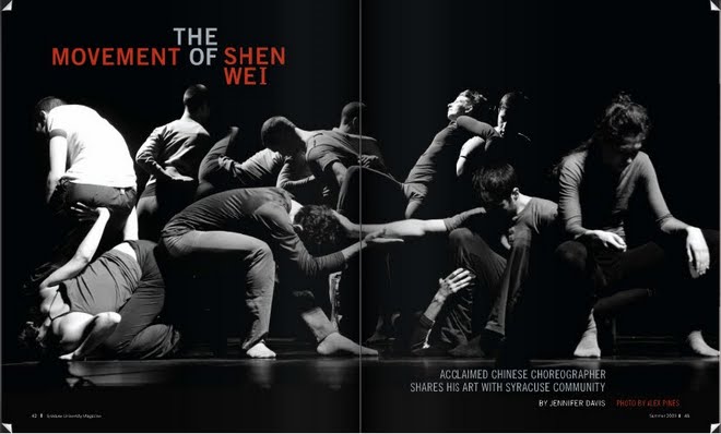
I have researched and discovered this particular university magazine.It is clear, by the defined expected connotations of a magazine title, that this magazine is called the "Syracuse University Magazine." The font stands out and draws the audience's eye, with the large, silver, plain font. The colour of the font suits well with the colour themes and tones chosen throughout the cover.The title is easily definable from the rest of the text.Lower down is centralized pieces of text. This block of text describes the image on the front cover and the theme. It explains that all the decisions made when constructing this front cover of the magazine, follows the story of "The movement of Shen Wei" which relates to a story inside the magazine. This draws attention and interest.The language used is fairly basic but interesting. The title 'Syracuse' stands out, and is actually the name of various cities around the world, America, Italy, China etc. I would presume this to be an American university magazine from the use of the English language. The language used in the magazine is well represented for the university students who would be able to understand the text.I would expect that the magazine being a university magazine, that the target audience would range between 19 - 27 year olds. Usually a university magazine would appeal to both male and females, but in this case the front cover is very much targeting most males. This because of the image used, which includes all males, and the colour choices, which would usually be appreciated by men.The institution would be the University who, presumably, create and dispatch the magazine, they may have a sponsor to fund the magazine, or adverts.The red text is used well, it adds the needed colour to the black and white theme. Red is the first colour that the eye sees and having this on the front cover as the only colour is intelligent as it will draw the audiences eye into the magazine.The connotations of using black, white, grey and red is that it could resemble darkness, evil, cold, hatred which may be themes linked to the "Chinese choreographer."The denotations of the image, is men hitting each other. The connotations could be, a battle, fight, war, dancing, aerobatics.The image is a key focal point to the magazine and sparks interest in the reader's mind. The image consumes 50% of the front cover space and has a good balance between itself and the text. The image representation is correct for the style of choreography and story. The age of the subjects within the image are of the right age to represent and interest the university students who would be the readers.
University/ Student Magazine Analysis
Syracuse University Magazine Double Page Spread
University/ Student Magazine Analysis
Syracuse University Magazine